
Visualize Morphospace#
Plot specimens in reduced space with optional shape overlays.
Setup#
import numpy as np
import pandas as pd
import matplotlib.pyplot as plt
import seaborn as sns
from sklearn.decomposition import PCA

from ktch.datasets import load_outline_mosquito_wings
from ktch.harmonic import EllipticFourierAnalysis
from ktch.plot import explained_variance_ratio_plot, morphospace_plot

data = load_outline_mosquito_wings(as_frame=True)
coords = data.coords.to_numpy().reshape(-1, 100, 2)

efa = EllipticFourierAnalysis(n_harmonics=20)
coef = efa.fit_transform(coords)

pca = PCA(n_components=5)
scores = pca.fit_transform(coef)

df_pca = pd.DataFrame(scores, columns=[f"PC{i + 1}" for i in range(5)])
df_pca.index = data.meta.index
df_pca = df_pca.join(data.meta)
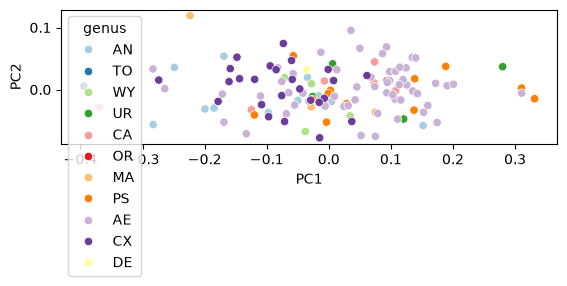
Basic scatter plot#
fig, ax = plt.subplots()
sns.scatterplot(data=df_pca, x="PC1", y="PC2", hue="genus", palette="Paired", ax=ax)
ax.set_aspect("equal")
Morphospace with shape overlays#
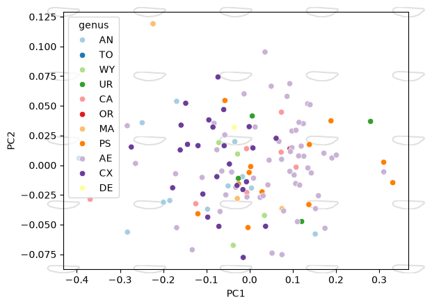
ax = morphospace_plot(
    data=df_pca,
    x="PC1", y="PC2", hue="genus",
    reducer=pca,
    descriptor=efa,
    palette="Paired",
    n_shapes=5,
    shape_scale=0.5,
)
Landmark morphospace with links#
from ktch.datasets import load_landmark_mosquito_wings
from ktch.landmark import GeneralizedProcrustesAnalysis

data_lm = load_landmark_mosquito_wings(as_frame=True)
df_coords = (
    data_lm.coords.unstack()
    .swaplevel(1, 0, axis=1)
    .sort_index(axis=1)
)
df_coords.columns = [
    dim + "_" + str(idx) for idx, dim in df_coords.columns
]

gpa = GeneralizedProcrustesAnalysis().set_output(transform="pandas")
df_shapes = gpa.fit_transform(df_coords)

pca_lm = PCA(n_components=5).set_output(transform="pandas")
df_pca_lm = pca_lm.fit_transform(df_shapes)
df_pca_lm = df_pca_lm.join(data_lm.meta)

links = [
    [0, 1], [1, 2], [2, 3], [3, 4], [4, 5], [5, 6],
    [6, 7], [7, 8], [8, 9], [9, 10], [10, 11],
    [1, 12], [2, 12], [13, 14], [14, 3], [14, 4],
    [15, 5], [16, 6], [16, 7], [17, 8], [17, 9],
]
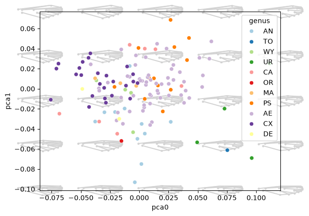
ax = morphospace_plot(
    data=df_pca_lm,
    x="pca0", y="pca1", hue="genus",
    reducer=pca_lm,
    n_dim=2,
    links=links,
    palette="Paired",
    n_shapes=5,
    shape_scale=1.0,
    shape_alpha=1.0,
    s=5,
)
Multiple component pairs#
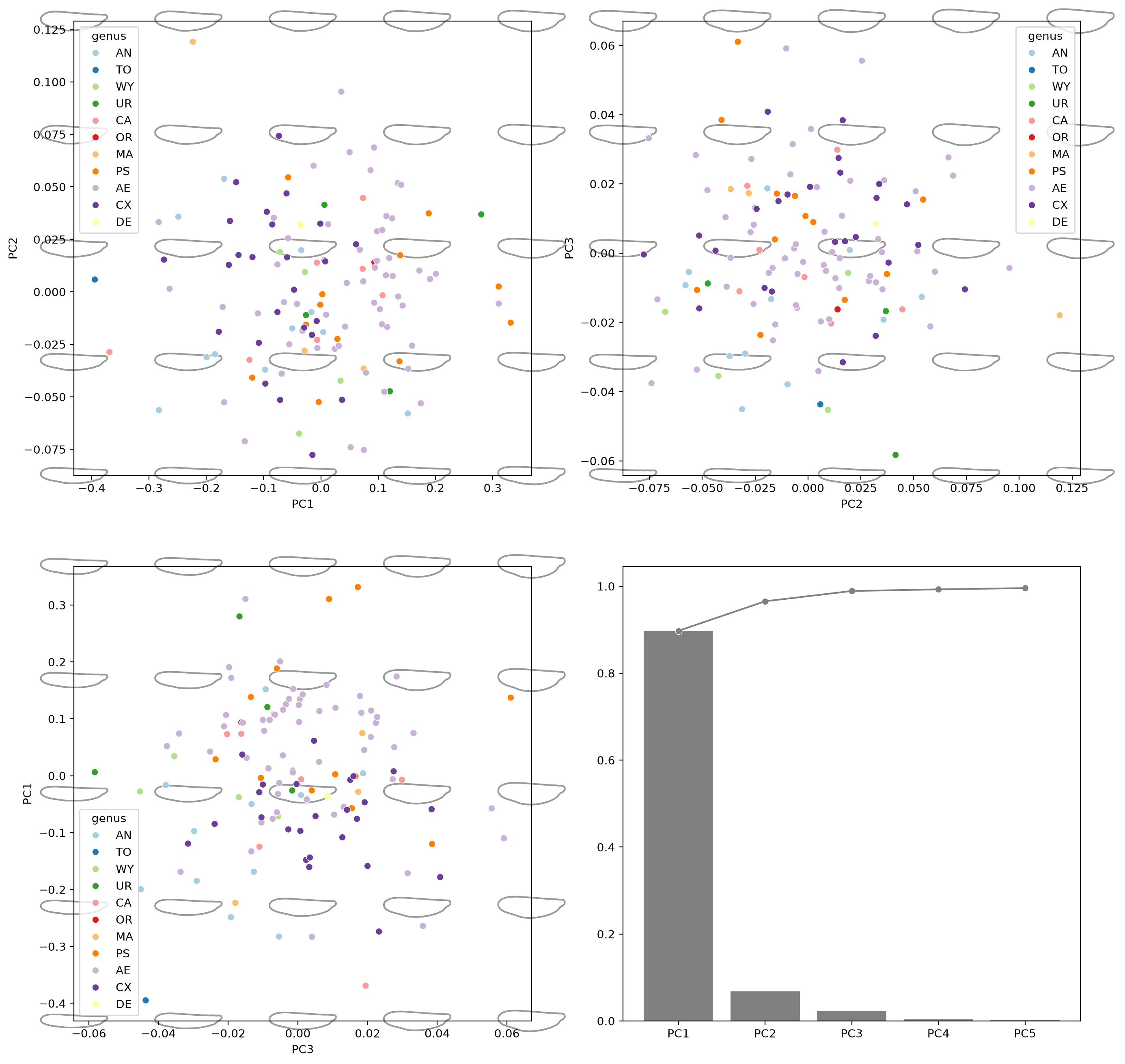
fig, axes = plt.subplots(2, 2, figsize=(16, 16), dpi=200)

for ax, (i, j) in zip(axes.flat[:3], [(0, 1), (1, 2), (2, 0)]):
    morphospace_plot(
        data=df_pca,
        x=f"PC{i + 1}", y=f"PC{j + 1}", hue="genus",
        reducer=pca,
        descriptor=efa,
        components=(i, j),
        palette="Paired",
        n_shapes=5,
        shape_color="gray",
        shape_scale=0.8,
        shape_alpha=0.8,
        ax=ax,
    )

explained_variance_ratio_plot(pca, ax=axes[1, 1])
<Axes: >
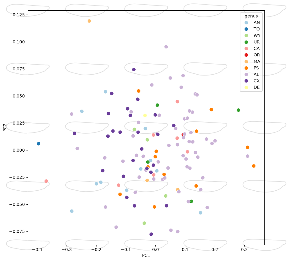
Compose with existing axes#
When called without data/x/y, morphospace_plot skips the
scatter step and adds only shape overlays, using the current axis
limits to position them. Pass the pre-populated axes via ax.
fig, ax = plt.subplots(figsize=(10, 10))
sns.scatterplot(
    data=df_pca, x="PC1", y="PC2", hue="genus", palette="Paired", ax=ax, s=80,
)
morphospace_plot(
    reducer=pca,
    descriptor=efa,
    components=(0, 1),
    ax=ax,
)
<Axes: xlabel='PC1', ylabel='PC2'>
Plot explained variance#
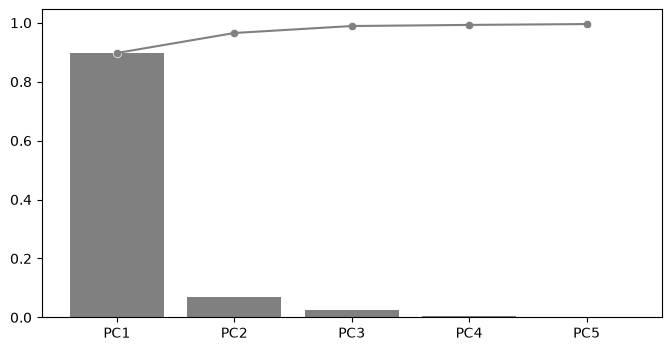
fig, ax = plt.subplots(figsize=(8, 4))
explained_variance_ratio_plot(pca, ax=ax)
<Axes: >
See also
Distribution on Morphospace for confidence ellipses and convex hulls
Visualize Shape Variation for visualizing shape changes along component axes
Use Non-PCA Reducers for using KernelPCA and other non-PCA reducers
Morphometric Visualization for the reconstruction pipeline design
Reconstruct Shapes for shape reconstruction
Elliptic Fourier Analysis for a complete EFA workflow